// case.02 — fintech
Lendora
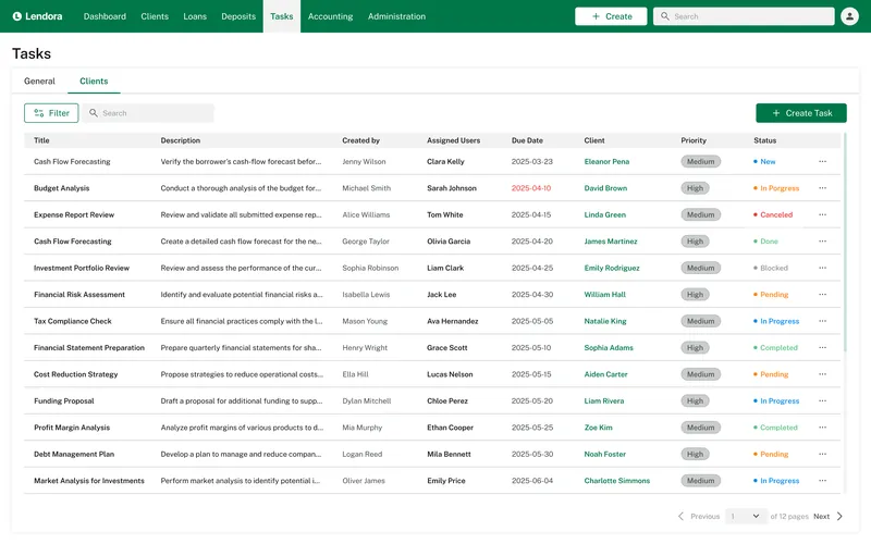
A lending and portfolio platform for a finance team — rebuilt around clear numbers, one client view and fewer clicks.
// case.overview
The challenge
// problem
Loan officers jumped between spreadsheets, separate tools and long forms. Key numbers were buried, and routine actions took too many steps.
// approach
I mapped the core flows with the team, set a clear information hierarchy and built a component library so every screen speaks the same language.
// focus
Dashboard-first navigation, a single client profile, readable loan schedules and a calm, trustworthy visual tone.
// case.work
Key screens
Four flows that cover most of a loan officer’s day.
 01
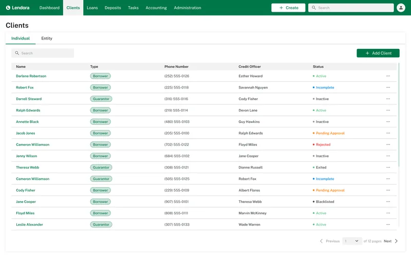
Clients at a glance
Search, filters and status tags instead of a spreadsheet tab per segment.
 02
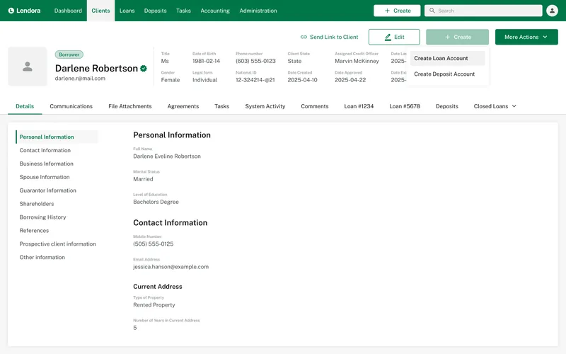
One client profile
Every detail, document and loan in a single place.
 03
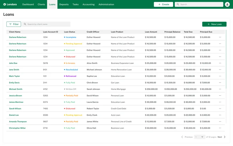
Portfolio in one list
Every loan with the numbers that matter: balance, status, days past due.
 04
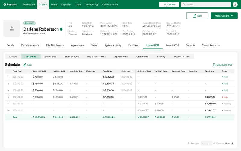
Readable schedules
Repayments as a clear timeline instead of a raw table.
// case.system
Visual language
// typeface
Public Sans
regular · semibold — 12 / 14 / 16 / 24
// palette
- Primary#007749
- Primary light#389571
- Ink#1E1E1E
- Surface#F2F3F2
- Warning#F2B57C
- Info#84C0E4
// case.result
Outcome
A calmer, faster workspace: the full picture of a client on one screen, and a consistent system the team can keep extending.
- 7
- key screensredesigned end to end
- 4
- core flowsmapped with the team
- 1
- client profilereplacing scattered tools
- 1
- component libraryshared by every screen